How to use the GrapeSEED Connect interface
There are two main views within GrapeSEED Connect: Gallery view and Lesson Plan view.
Gallery View
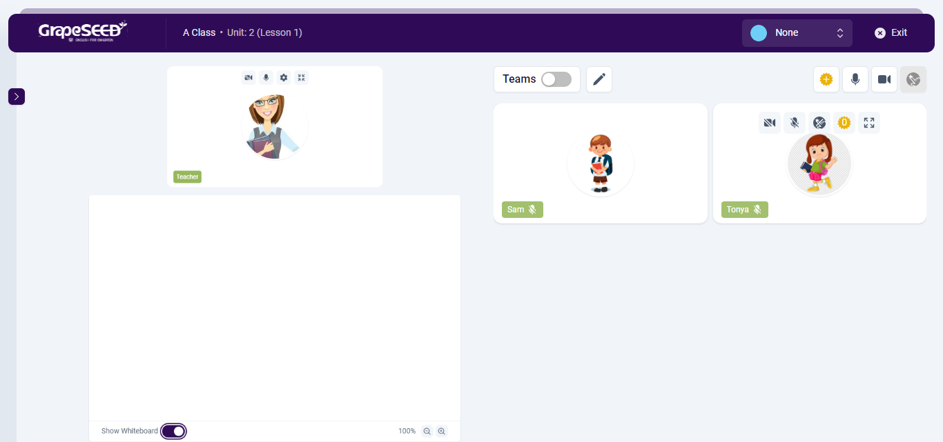
Gallery view is the default view when a GrapeSEED Connect class is started. On the right, you will find all the student video feeds with the classroom management buttons above the class video panel. In the header of the page, you should see a light blue circle that contains the Jonny Bear instructional icons. In the middle you will see your video feed as the teacher with the annotation panel attached to the right side of your video feed. Below it, you will find the whiteboard toggle which opens and closes the whiteboard. On the left side you will see a red rectangle with the unit and lesson number label, as well as an arrow. By clicking on that arrow, you will open the Lesson Plan View.
There are a variety of features/controls on this view, all of which are also used in the Lesson Plan View.
-
The class management features include instructions on using class management buttons, Jonny Bear instructional icons, and managing both teacher and individual student audio/video feeds.
-
The annotation features cover how to annotate, zoom, and use the whiteboard effectively.
-
The lesson plan features include instructions on how to open the Lesson Plan View.
Lesson Plan View
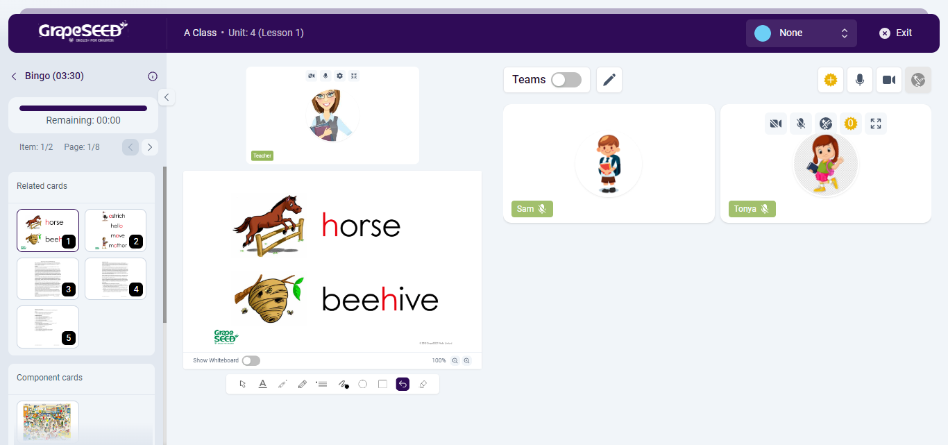
Lesson Plan view is your primary teaching view. The first time you open it during a class session it will default to the first component of the lesson plan. On the left side, you will see the lesson plan panel. When a component has been selected, you will see the component panel but if you navigate backwards within that sidebar, you can see the full lesson plan and all associated components. At the top of the Lesson Plan Panel, you will see several pieces of information, in order, from top to bottom:
- If a component is open: Under the Unit and Lesson number, you will see a gray bar containing a navigation arrow, the name and estimated teaching time of the component along with the teaching instruction information icon

- The "Unit | Lesson" label can be clicked to open a dialog box to change the unit and/or lesson number for that session. You do not have to exit the session to change unit/lessons and students will not be kicked out if you change. Only the lesson plan content will be changed.
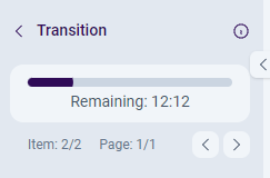
- A horizontal bar with the remaining estimated teaching time in the lesson in MM:SS format
- The Item number that indicates what item in the lesson plan you are on.
- The page number that indicates what page of the current item/component you are on.
- Blue left/right navigation arrows to navigate the component images
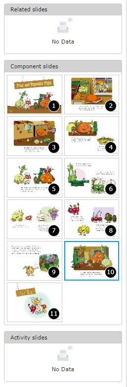
- The component panel containing 3 sections when you first open a component:
- Related slides: Things like Vocabulary Picture Cards show up here
- Component slides: Component pages show up here
- Activity slides: Specific images related to specific teaching activities show up here
- Additional Content is provided as a fourth section in the component panel after all components have been taught. There are no teaching instructions for this content. Additional Content is indicated by
 .
.
In this view, the student video feeds, the annotation panel, the whiteboard and all your other controls work exactly like they do in gallery view.
Read more for information on how to use the Lesson Plan specific features.